Since a lot of my readers are frequent travelers I think venting here a bit on some of the frustrations of traveling will be well received. I want to focus on a pet peeve of mine, hotel personal hygiene gels. I’m talking about Shampoo, Conditioner, and Body Wash.
For about the last 10 years I’ve been afflicted with the ICSS disease. Meaning, “I Can’t See Shit”. I’m able to see far away but I need readers to read anything with small text. Which is fine most of the time, I have my progressive lenses on my glasses so I’m able to adapt. But one place I don’t wear my glasses is the shower. And in the shower I’m confronted with this.

Can you guess which one is Shampoo and which is Body Wash? It’s bad enough the text is too small for me to read, but the contrast and color choice between the bottle and text is so bad it makes it even more unreadable. See below of a closer look.
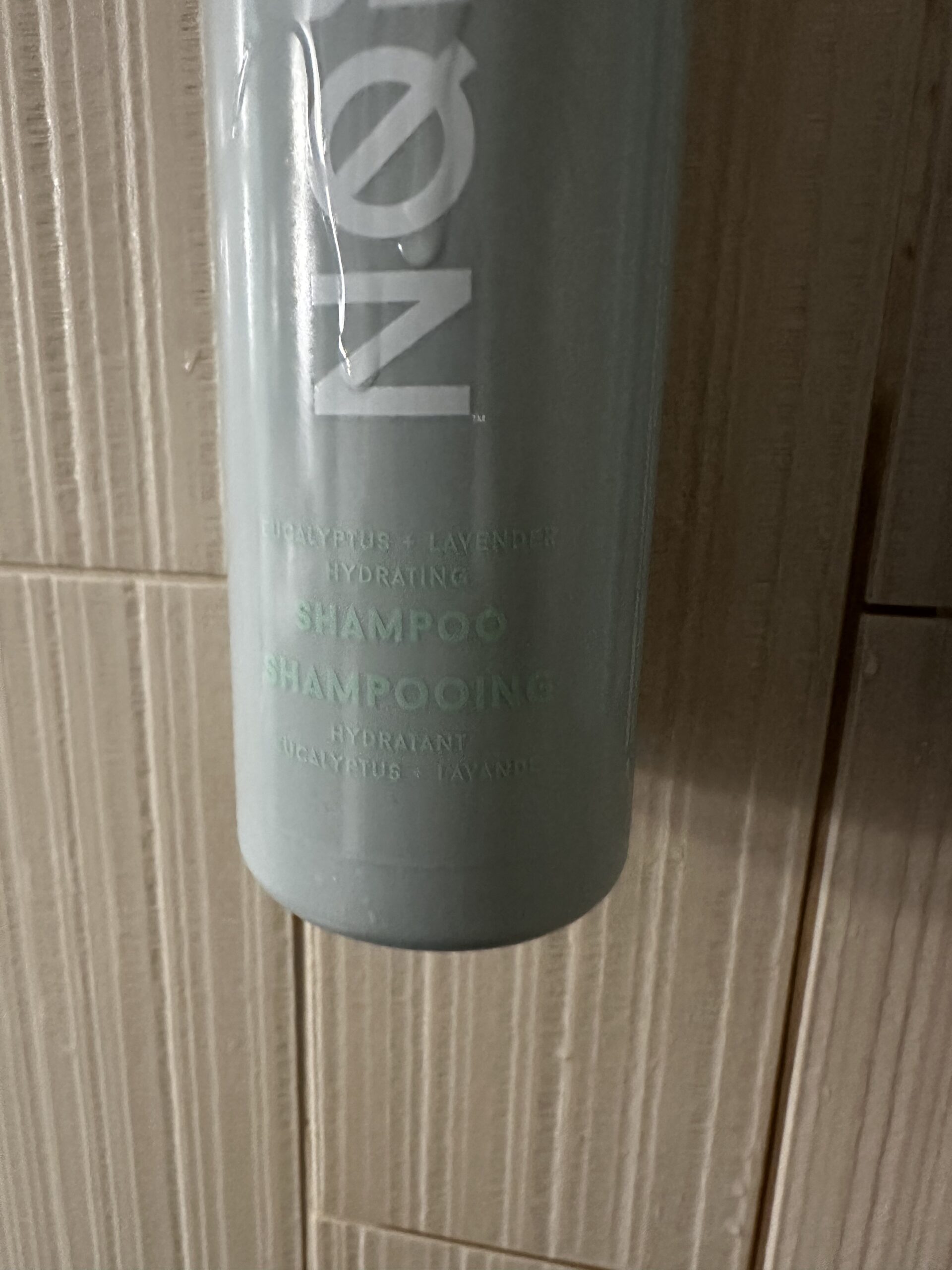
Someone should be fired. And don’t get me started with those teeny tiny bottles, the text is too small on those too! So what is a frequent traveler to do? Enter my trusty Sharpie.

To the ownership of the Courtyard by Marriott and their next hotel guest in room number 211, you’re welcome.

You are not wrong! And this is too good! Well done sir.
It rubs the lotion on the skin.
Thank you from all us!!
I love this!! Thank you for just saying it the way it is.
The have finally fixed this. The new bottles are rolling out to Marriott’s now, but they are working through the remaining stock.
But this is a perfect example of UX Matters.
You are an under-appreciated humanitarian.
Well, they are hung left to right in the order they should be used. . .and hanging on the shower wall in big bottles with easy to use pump action. Just sayin… Try staying at a Best Western or Holiday Inn next time for a fresh perspective (tiny bottles of Suave and silver dollar sized soaps) LoL Luv U G
Absolutely agree!!!! The struggle is real!